
Creating motocross graphics sounds simple until you actually try to create something nobody has seen before. Open Illustrator. Draw some shapes. Add a few colors. Throw a number on the side. Done, right?
Not even close. After years of designing MX graphics, one of the hardest parts isn’t knowing how to design. It’s finding the next idea. Something fresh enough to feel new, but still unmistakably motocross. Something that works across completely different bikes. Something riders actually want to put on their machines.
We sat down with Tom, Head Designer at OMX Graphics, to talk about where ideas come from, chasing trends without copying them, experimenting with concepts that sometimes go nowhere, and why designing dirt bike graphics is basically a never-ending search for the next thing.
Tom, after creating so many designs, is it actually getting harder to come up with something new?
Tom: Absolutely.
In the beginning, you have hundreds of ideas because everything feels unexplored. After years of doing it, you realize you’ve already used that line, that composition, that type of fade, that pattern, that color combination. And it’s not only us. You’re surrounded by thousands of bikes online every day. Race teams, helmet designs, riding gear, custom builds, automotive stuff, streetwear, posters, album artwork. There’s visual information everywhere. So the challenge becomes filtering all of that. You don’t want to create another version of something that already exists. The goal is always to find a different angle. Sometimes that happens in an hour. Sometimes you stare at the screen and absolutely nothing happens.
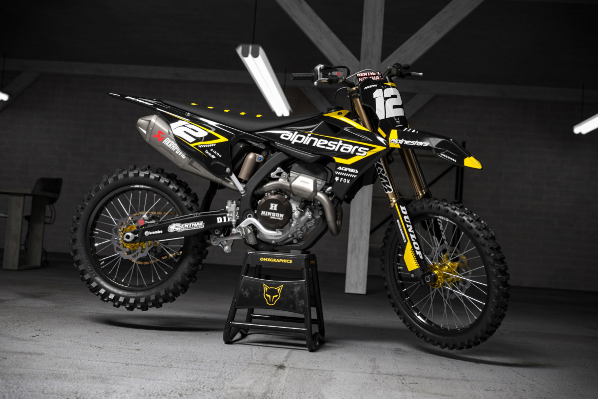
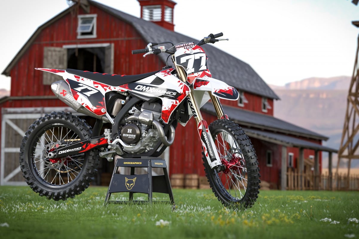
So where do new mx graphics ideas actually come from?
Tom: Everywhere. Literally.
Obviously, we watch motocross because you have to understand what is happening inside the industry. You notice what factory teams are doing, what colors are appearing more often, what riders are wearing, how helmets are changing and what kind of bikes people are building. But if you only look at motocross for inspiration, eventually motocross starts looking like motocross. That’s when it gets boring. A lot of inspiration comes from completely unrelated places. Motorsport, fashion, sneakers, old racing liveries, tattoos, typography, graffiti, architecture, music artwork, surf culture, 80s and 90s graphics, packaging or even some random sign you see somewhere. You might see one tiny detail that has absolutely nothing to do with dirt bikes and think, wait… that could work. Then you bring that idea into the MX world and start experimenting.
How important are trends?
Tom: You have to follow them, but you shouldn’t become a slave to them. There’s a difference. Design trends tell you where visual culture is moving. Maybe everything suddenly becomes cleaner. Then six months later people want crazy colors again. Retro comes back. Chrome comes back. Minimalism comes back. Then detailed graphics return. Everything moves in cycles. We watch that closely, but copying whatever is popular right now is probably the fastest way to make a design look old next year. I think the better approach is taking a small piece of a trend and mixing it with something completely different. That’s usually where interesting things start happening.
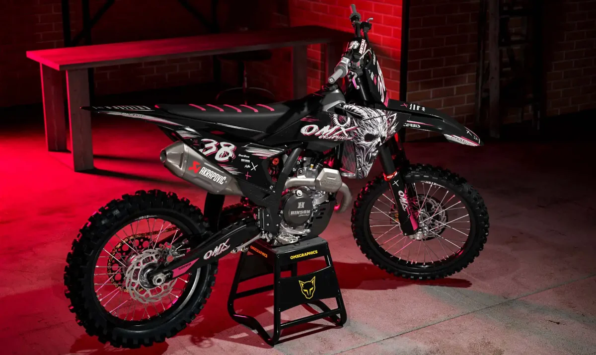
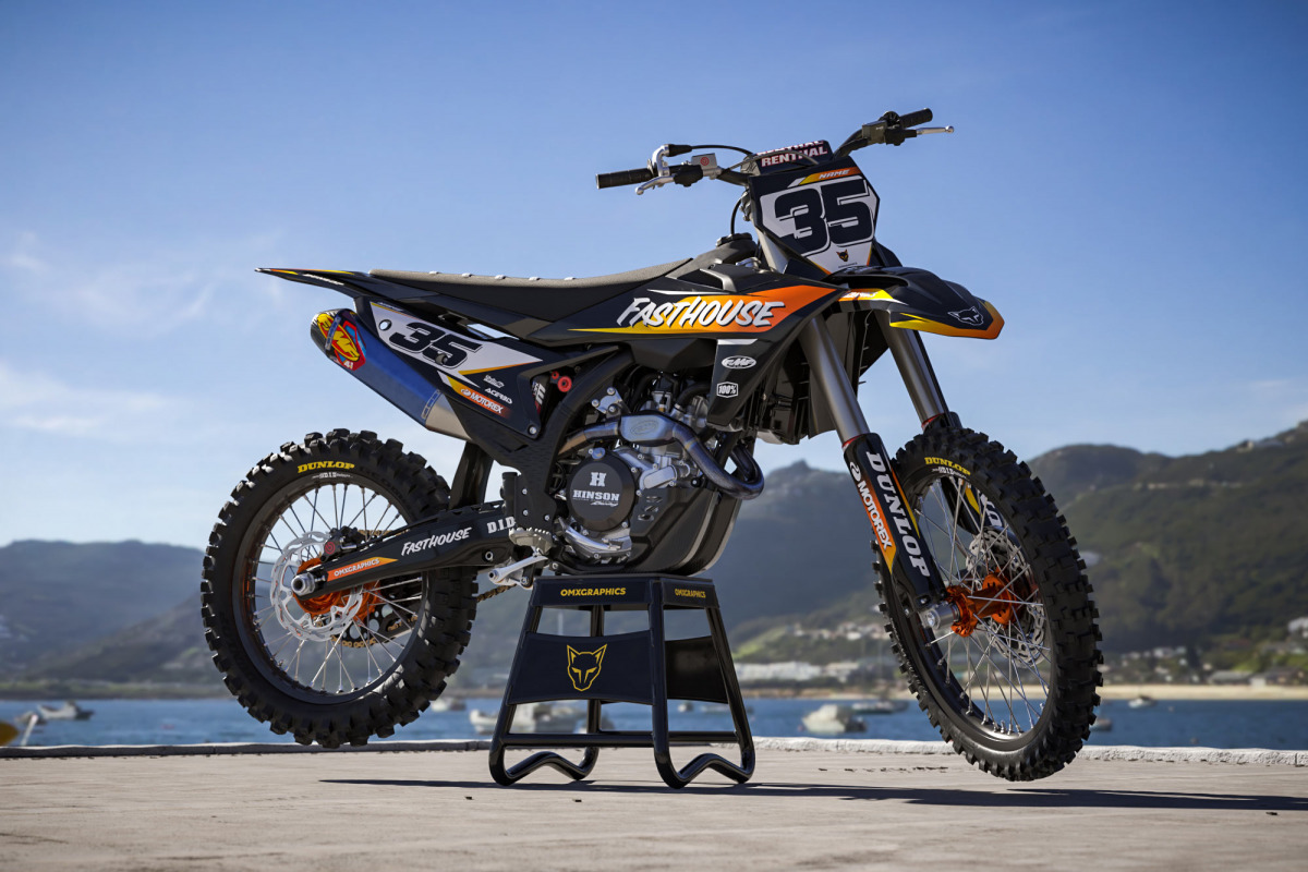
Does experimenting play a big role?
Tom: Probably the biggest.
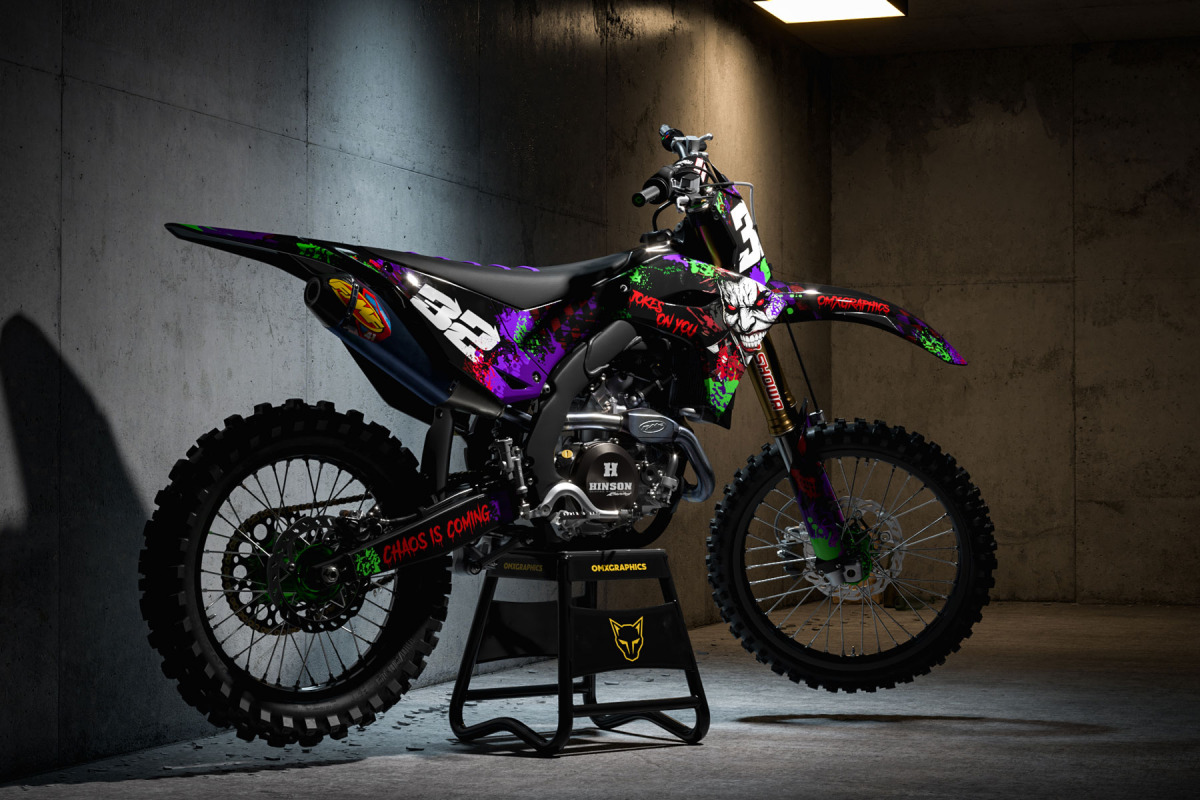
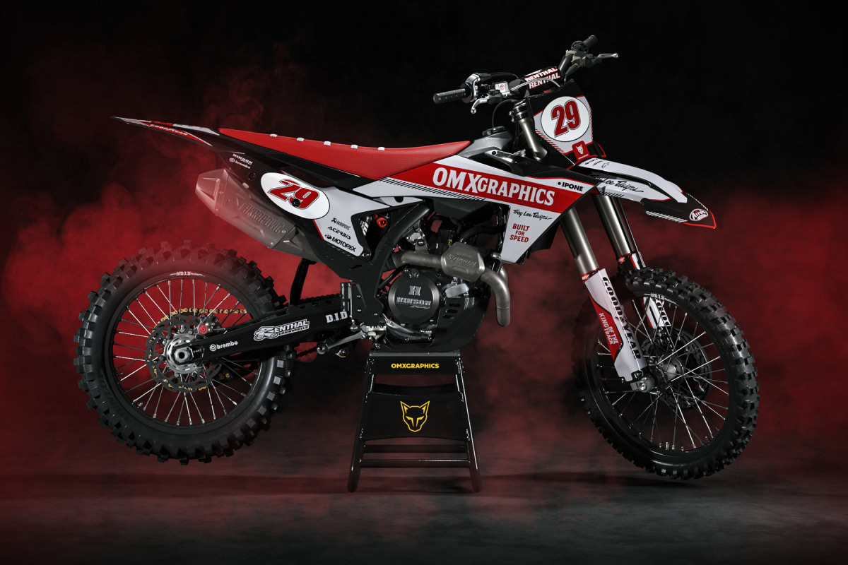
There are designs where the finished version looks almost nothing like the original idea. You start with one direction, change the typography, move something around, delete half of it, add something completely stupid just to see what happens…and suddenly that stupid experiment becomes the best part of the design. That happens all the time. The dangerous moment is when you start becoming too comfortable. You discover a style that works, customers like it, and naturally you want to repeat it. But if you keep doing that, eventually every new design becomes the previous design wearing different clothes. So sometimes we intentionally go in the opposite direction. If the last few designs were complicated, make something ridiculously simple. If everything has sharp aggressive lines, try flowing shapes. If everyone is using dark colors, go bright. You need to keep breaking your own habits.
How do you know when an experiment actually works?
Tom: Put it on the bike.
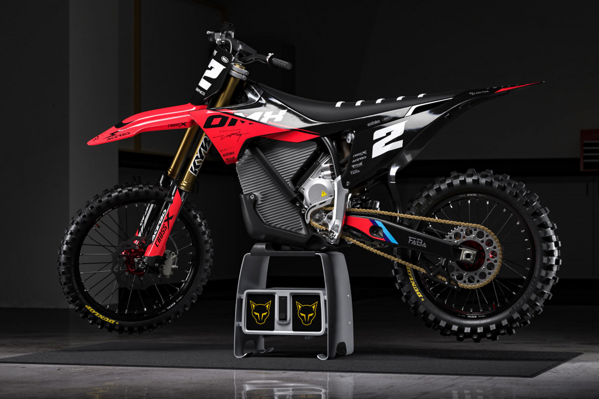
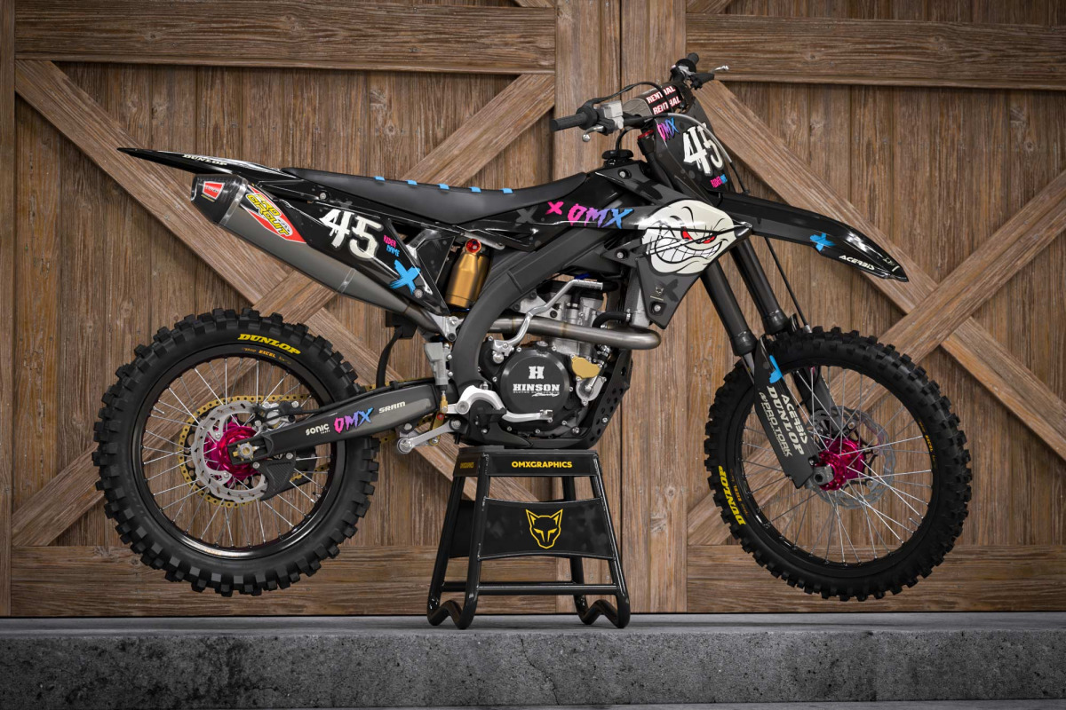
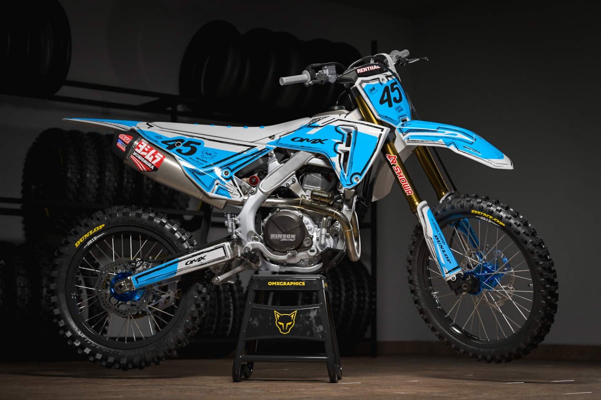
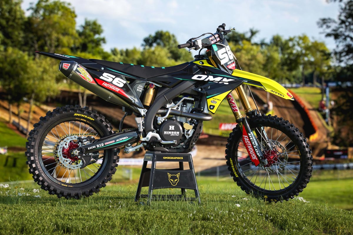
That changes everything. Something can look amazing as artwork on a screen and completely wrong once it’s spread across motocross plastics. A dirt bike isn’t a rectangular canvas. Every panel has a different shape, angle and size. The radiator shroud might give you plenty of space while another section cuts straight through the element you wanted to use. And every motorcycle is different. The important elements have to be repositioned and adapted so the original character of the design survives on different plastics. That part is almost another design process by itself.
Do customers influence future designs?
Tom: Definitely.
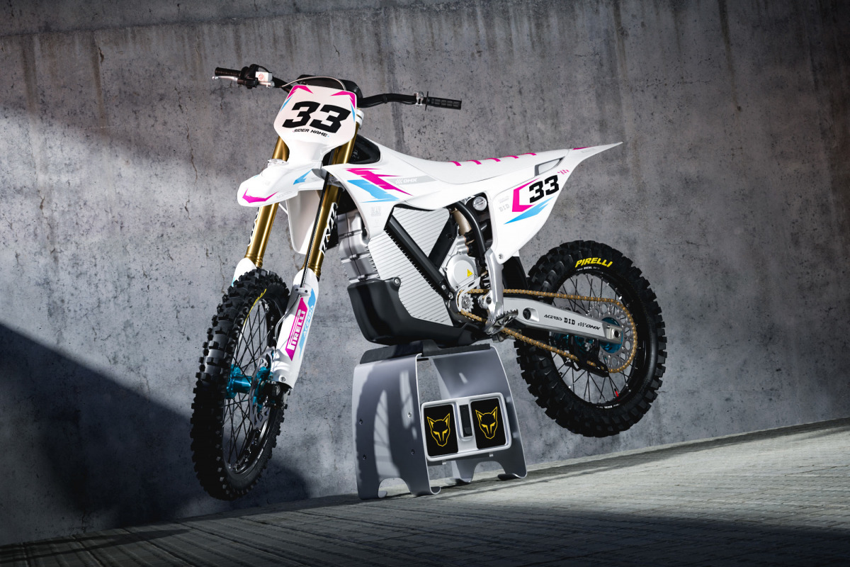
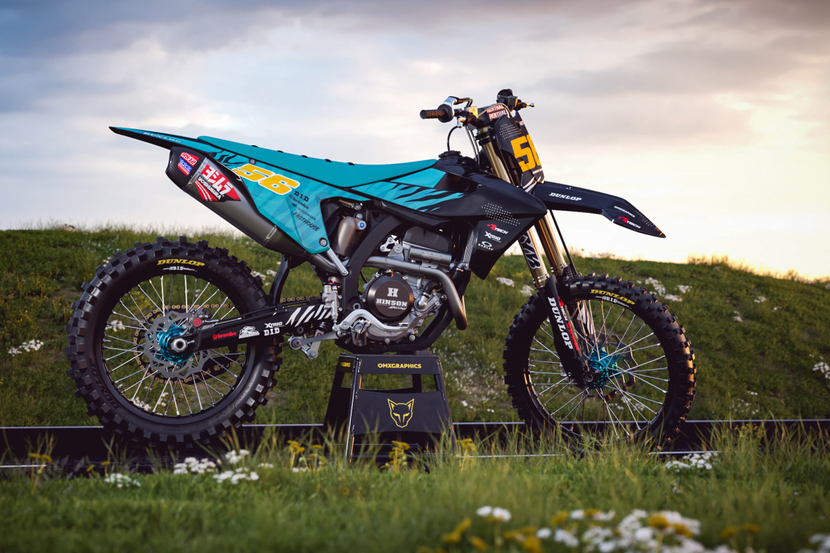
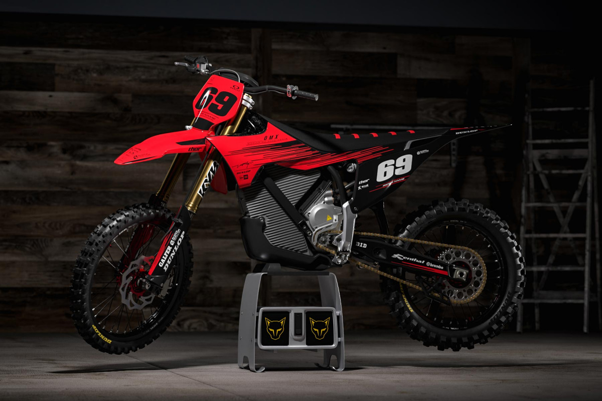
Customization teaches you a lot. At OMX, riders can change colors, numbers, names, logos and other details on our existing designs. We send a design preview before production, and changes can be made before anything gets printed. When you do that again and again, you start seeing patterns. Maybe riders keep asking for cleaner sponsor areas. Maybe a surprising color combination suddenly appears several times. Sometimes a customer asks for a change we would never have considered, and you look at it afterward and think, actually… that works. You learn from that. Design isn’t happening inside some closed room where nobody sees what riders are doing. The riders themselves are constantly giving us information.
You’ve also built a strong reputation on trustpilot and google. Does that influence how you look at the work?
Tom: For sure. We’ve been doing this since 2011, so seeing OMX Graphics maintain a high rating on Trustpilot and Google Reviews means a lot to us. We’re always experimenting, changing things and trying new ideas, so you never really reach a point where you think you’ve figured everything out. But when thousands of riders have trusted us with their bikes and the feedback stays consistently positive, it’s a pretty good sign that we’re doing something right.
And it’s not only about whether a design looks good. Riders judge the whole experience – the communication, customization, design preview, revisions, print quality, fitment and what finally arrives at their door. That feedback keeps us moving in the right direction, but it also keeps the pressure on. A strong reputation takes years to build, and every new order still has to live up to it.
OMX started in 2011. Has the design philosophy changed since then?
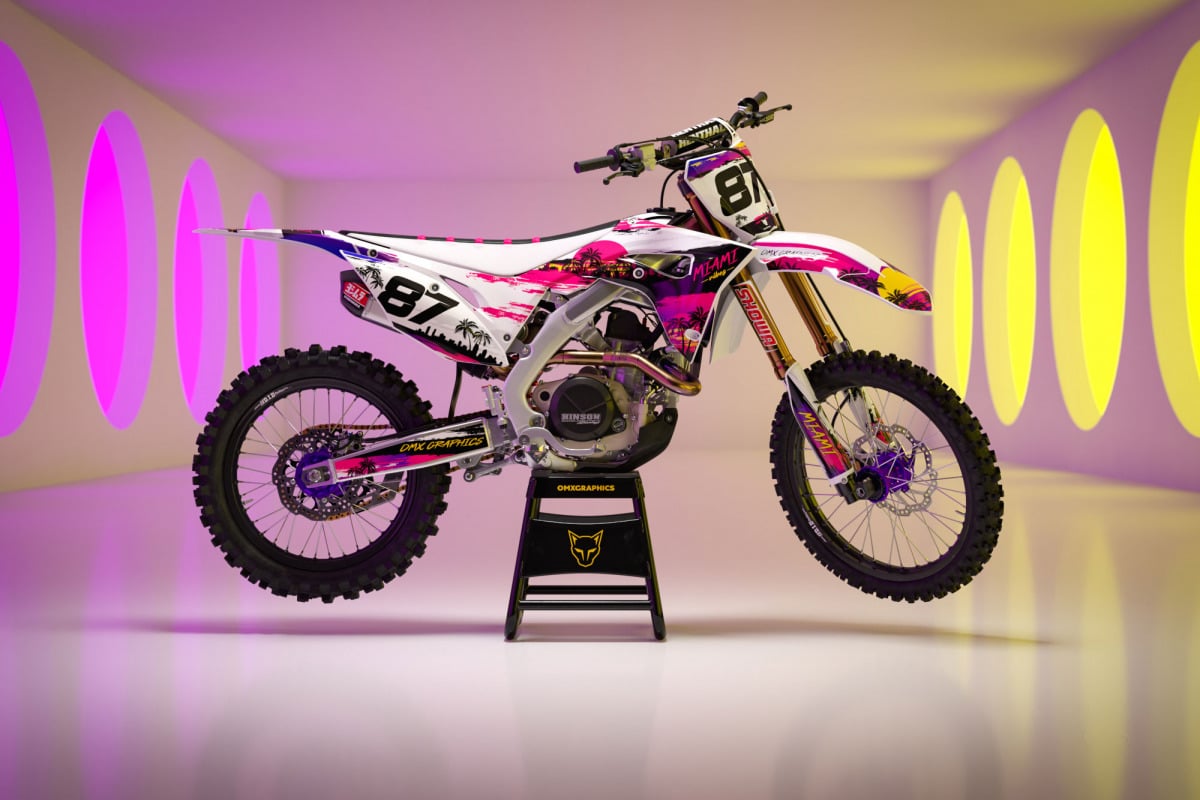
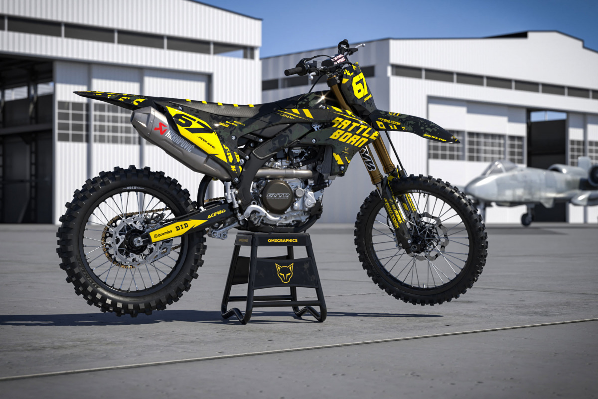
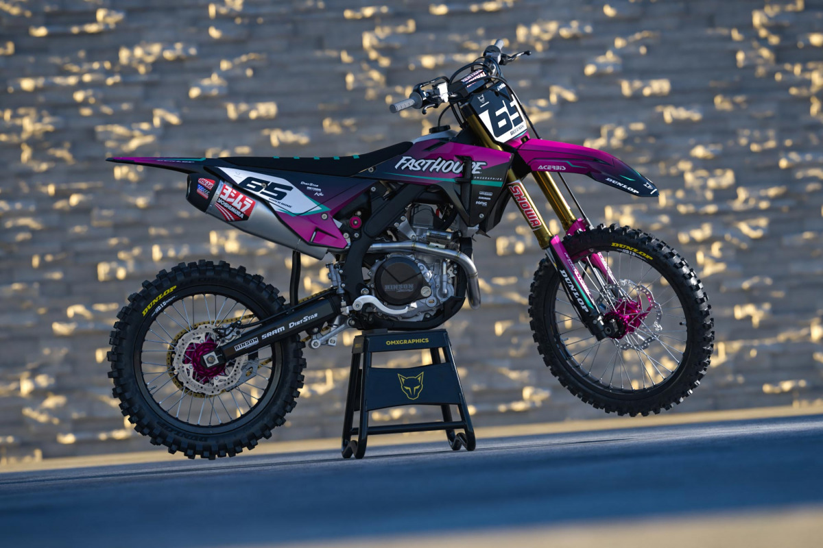
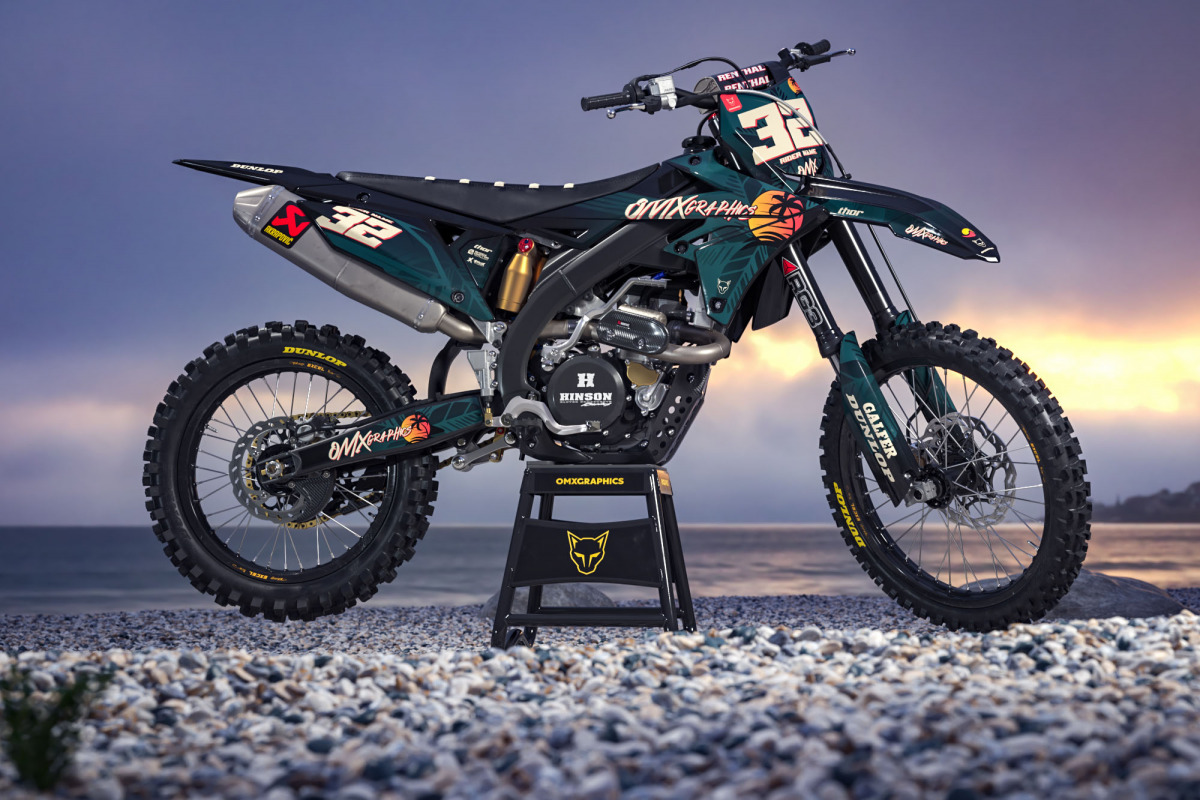
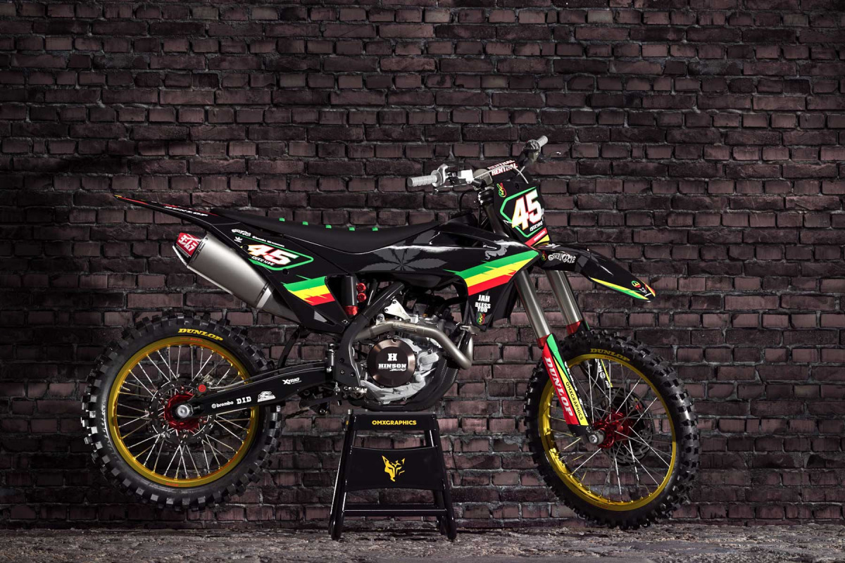
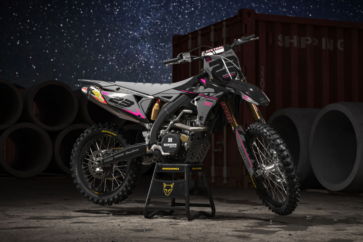
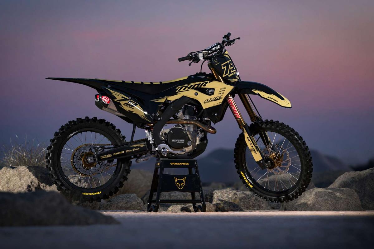
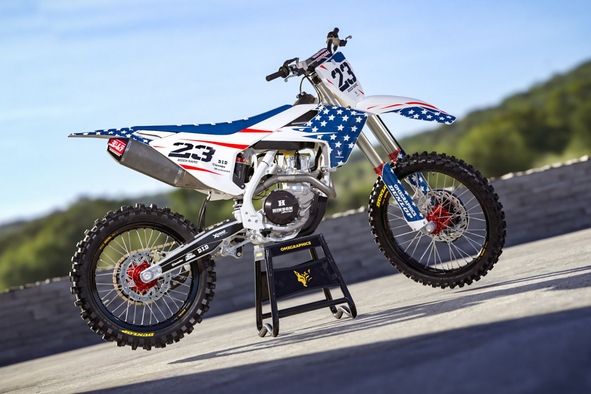
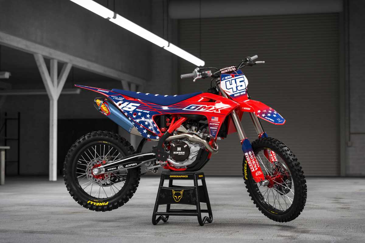
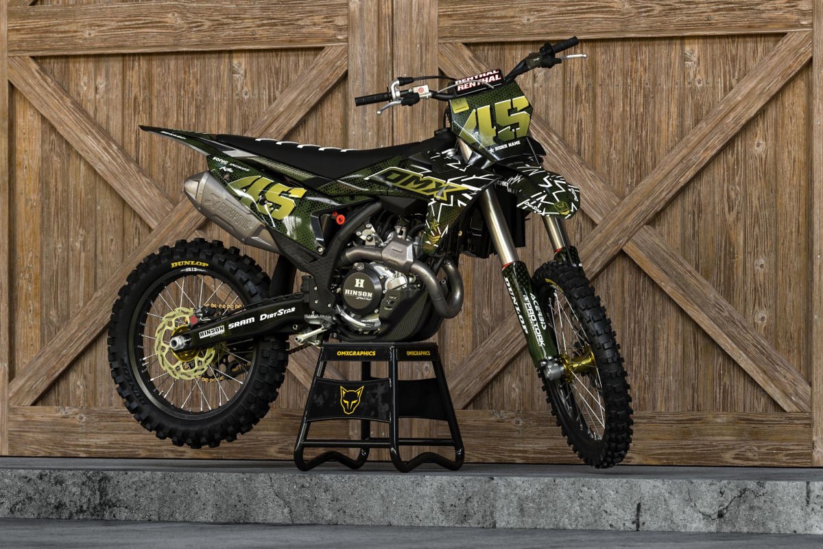
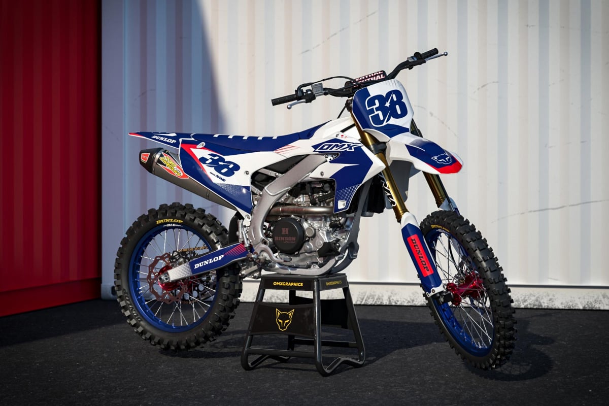
Tom: The tools change. Trends change. Bikes definitely change. But the basic idea hasn’t changed much. OMX originally started because the graphics available at the time simply weren’t exciting enough. The whole idea was to create something we would actually want on our own bikes. That mentality is still important. We don’t want to release a new design simply because the website needs another product. It has to bring something. Look at something like MIAMI. That design went into bright colors, retro energy and a completely different mood. AIRBORNE went toward layered details, broken elements and strong typography. GLITCH took another direction again – simple, bright and minimal. They don’t need to look related. That’s the point.
Is there such a thing as the perfect motocross graphics design?
Tom: No.
And hopefully there never will be. Because if we ever create the perfect one, what are we supposed to do the next morning? That search is probably the best part of the job. You finish something you really like. For a couple of days you think, this one is seriously good. Then another idea appears. Suddenly you want to try something else. And you start again.
The search never really ends
That might be the best description of motocross design at OMX Graphics. There is no finish line. Since 2011, bikes have changed, trends have disappeared and returned, colors have gone from loud to minimal and back again, and the possibilities for customization have grown massively. But every new design still begins in basically the same place: A blank screen. An idea.
And the question every designer knows very well: What haven’t we tried yet?
That question keeps the whole thing moving. Because the next favorite MX graphics design probably doesn’t exist yet.
We just have to find it.