
Some graphics are designed to look aggressive. Some are designed to look factory. And then there are those that exist for one simple reason – because riding dirt bikes is supposed to be fun. That’s exactly where our MIAMI MX graphics design came from. Bright colors, tropical energy, retro influences and just enough craziness to make the whole thing work. MIAMI isn’t trying to look like another factory race bike. It doesn’t take itself too seriously. It’s loud, colorful and instantly recognizable. Basically, good vibes only. And sometimes that’s exactly what a motocross bike needs.
A motocross design that doesn’t try to fit in
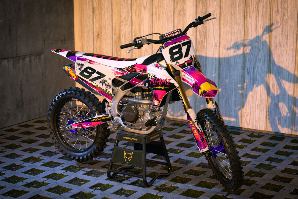
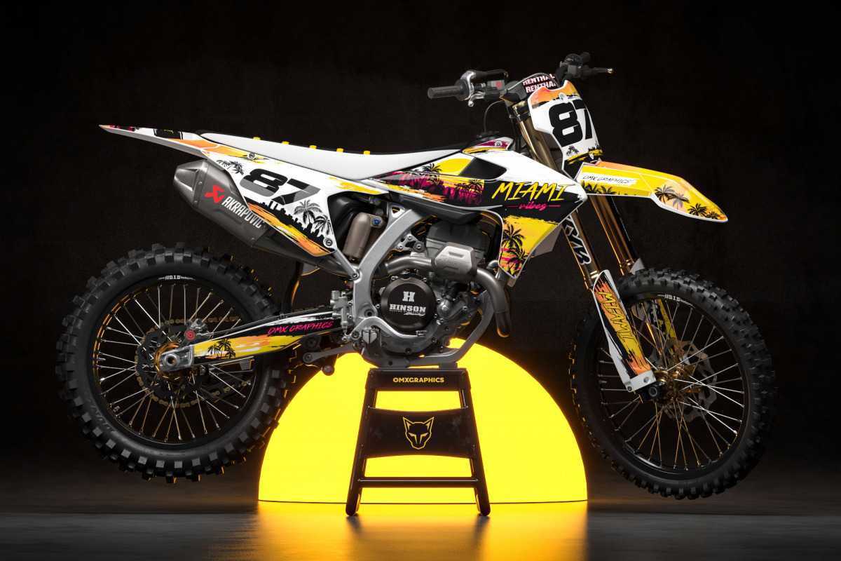
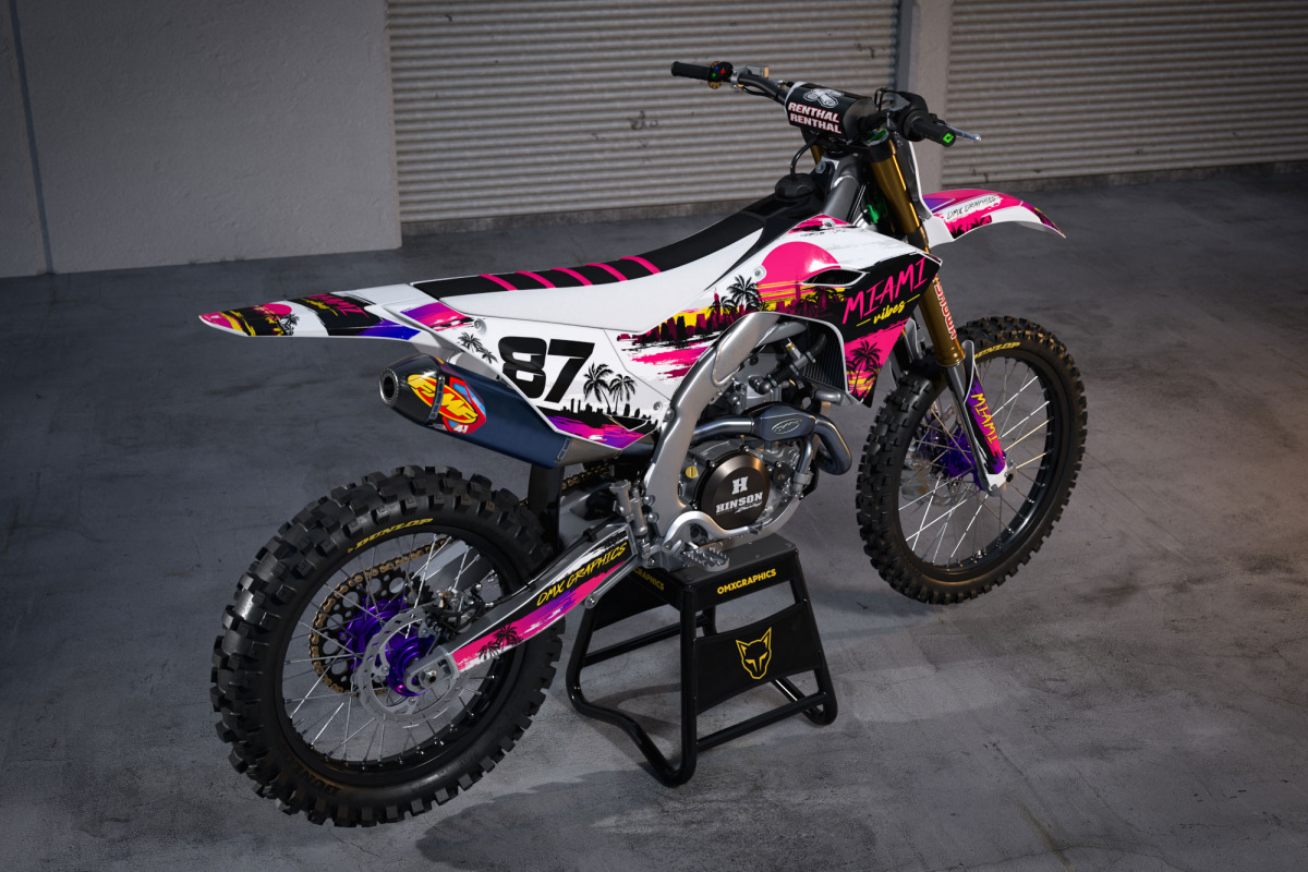
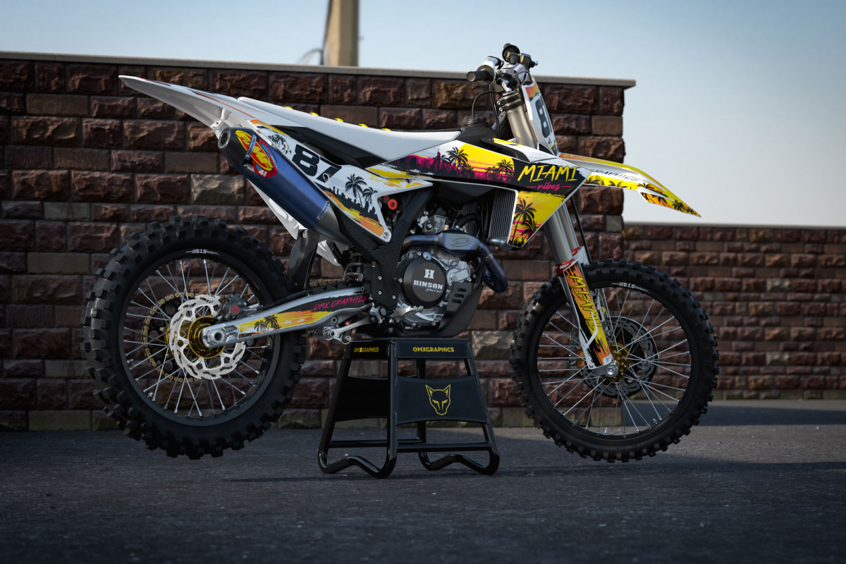
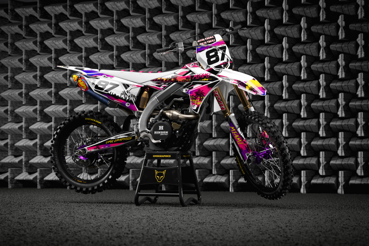
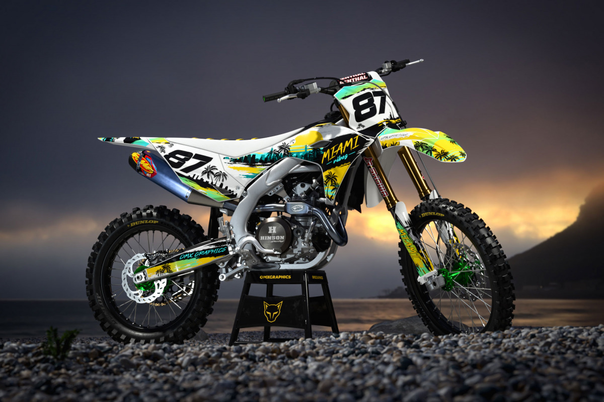
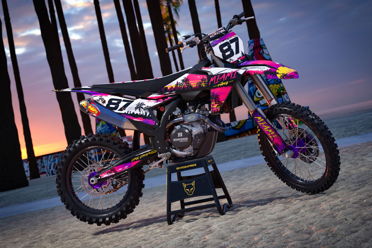
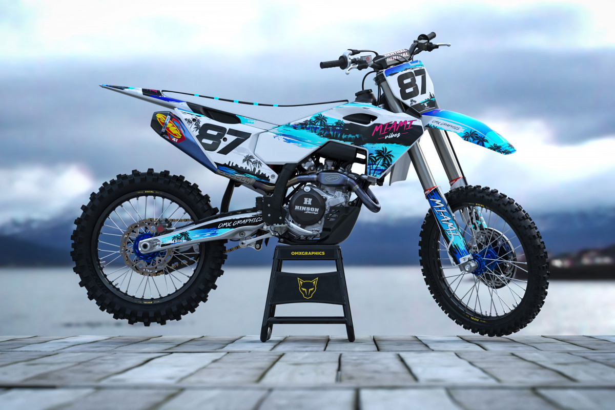
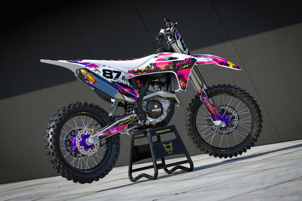
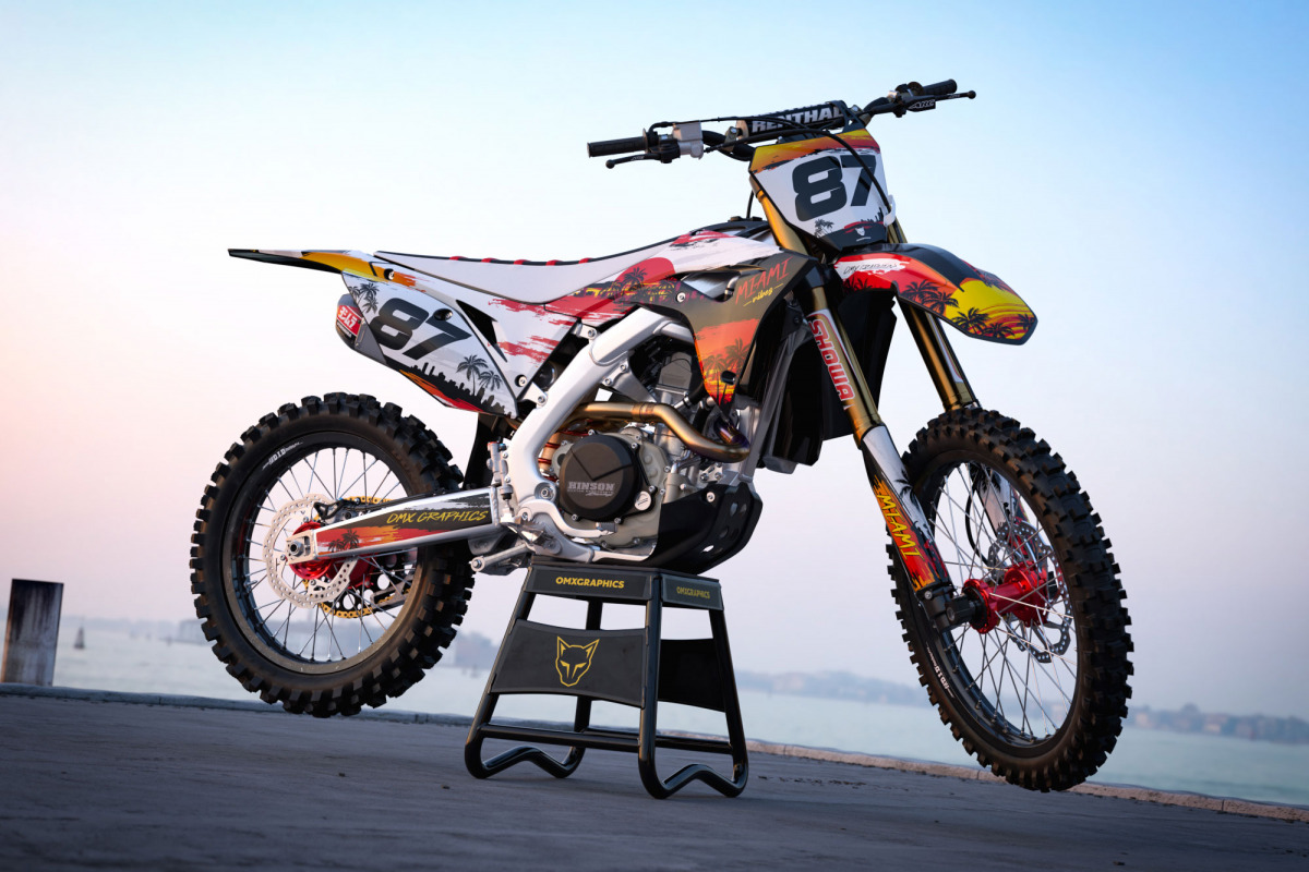
Walk through almost any motocross paddock and you’ll see plenty of familiar combinations. Black and orange. Red and white. Blue and black. Factory inspired layouts. Sponsor logos stacked neatly down the shrouds. Nothing wrong with that. But after working with dirt bike graphics for more than 15 years, we’ve learned that some riders simply want something different. MIAMI was created for them. The idea was to bring a completely different atmosphere onto a motocross bike. Think Miami sunsets, neon signs, palm trees, warm evenings, retro colors and that slightly crazy South Florida energy. Then throw all of that onto a motocross machine. Sounds questionable but looks ridiculously good. That contrast is actually what makes the design work. Motocross bikes are mechanical, aggressive and sharp. MIAMI brings in bright colors and a more playful visual style without losing the shape and speed of the bike. The result is a Miami motocross graphics design that stands out before the engine even starts.
Born from color
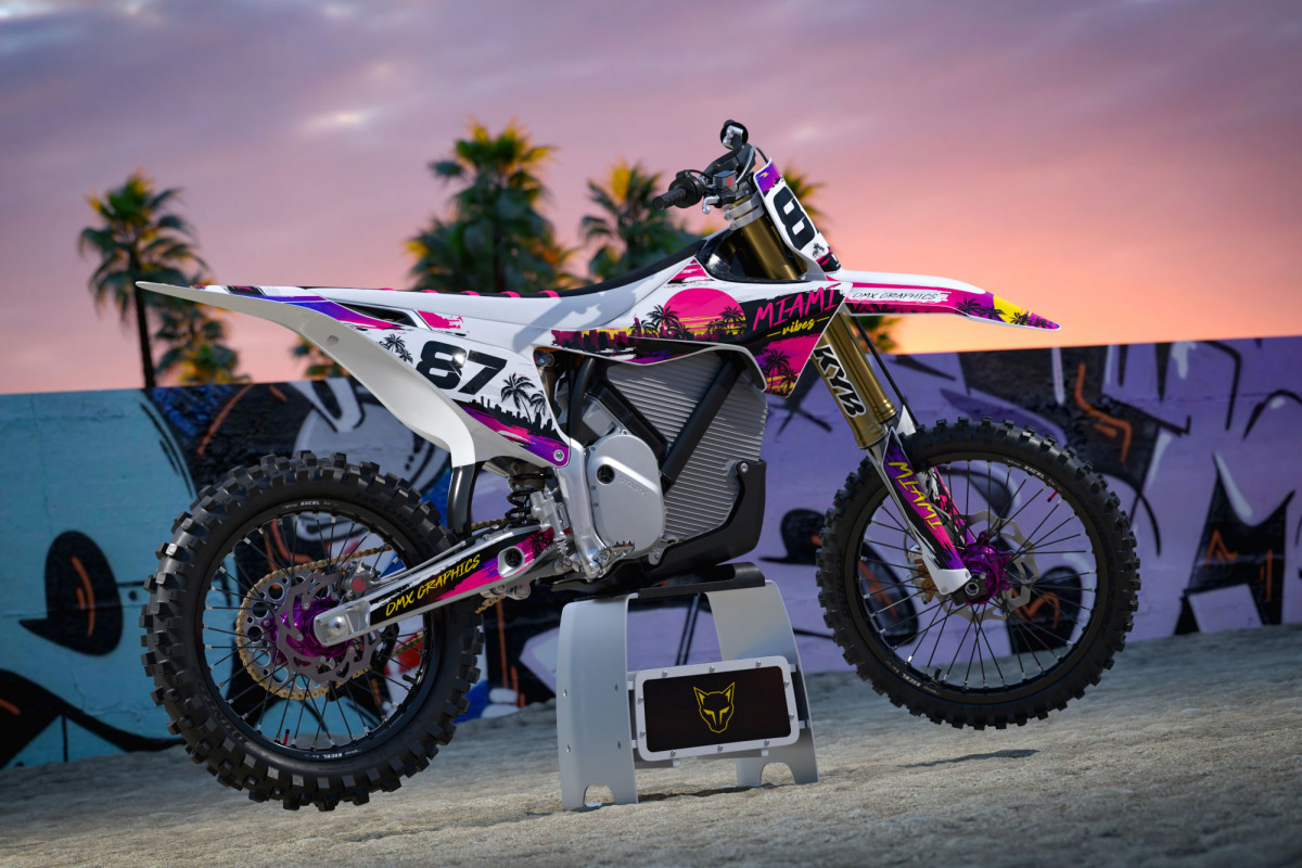
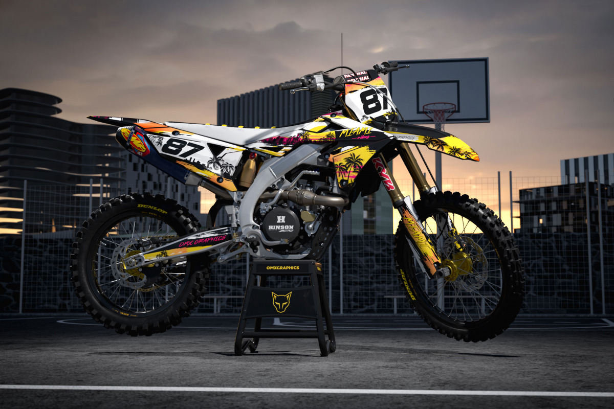
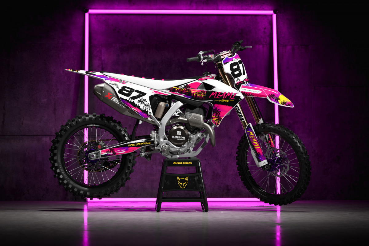
Color is obviously the biggest part of MIAMI. This isn’t a design where we were afraid to turn the saturation up. Pink, turquoise, purple, blue and other tropical tones work together across the plastics, while darker areas give the brighter elements enough contrast to really pop. But making a colorful MX design isn’t just about throwing every bright color you can find onto a template. There still needs to be flow. Every bike has different plastics, different angles and different proportions. A graphic that looks perfect on one model can completely fall apart when it’s transferred directly onto another. That’s why every MIAMI layout is adapted to the actual motorcycle. The lines need to follow the plastics. Important elements need to sit in the right places. The number plates need to remain readable. Logos need breathing room. Colors need to continue naturally from one panel to another. When everything lines up correctly, the bike looks like one complete design rather than a collection of stickers.
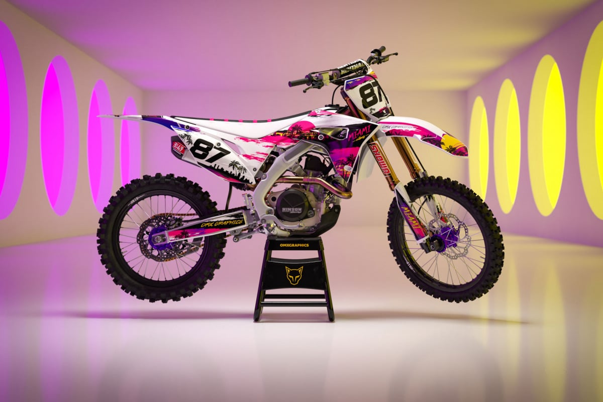
your bike, your version of miami MX graphics
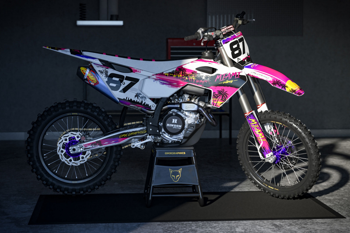
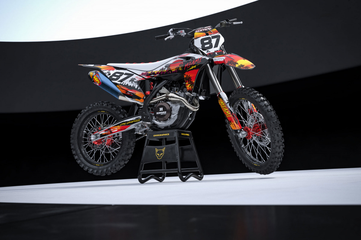
The original MIAMI design is only the starting point. Every OMX Graphics kit can be customized, and customization is free. Want your race number bigger? Easy. Different name? Obviously. Your own sponsors? Add them. Want to change some colors, remove a logo, add a flag or adjust certain details? Do it. We don’t believe a custom motocross graphics kit should force every rider to run exactly the same setup. Two riders can start with MIAMI and end up with two completely different-looking bikes. That’s part of the fun. Once your order is placed, our designers prepare a digital proof and send it to you by email before anything goes to production. You can check the numbers, names, logos, colors and overall layout. Need something changed? Tell us. We’ll revise it. And if another adjustment is needed after that, we’ll do it again. Unlimited revisions are included until you’re happy with the final design. Only after approval does the kit move into production.
made to be ridden
A motocross bike isn’t a display piece. It’s going to get covered in mud. Pressure washed. Hit by boots. Scraped by knee braces. Thrown into ruts. Dropped. Picked up. Loaded into a van and taken somewhere to repeat the whole process again. So underneath all those Miami colors still needs to be proper MX material. Our kits are produced using 21MIL total thickness pro material with strong adhesive and FLO Technology for bubble-free installation. The thickness gives the graphics the heavy duty feel riders expect from professional motocross graphics while the adhesive system makes installation much easier when you’re applying the kit at home. Because however good a design looks on a screen, it needs to work on the bike. That’s always been the point.
Miami across different bike brands
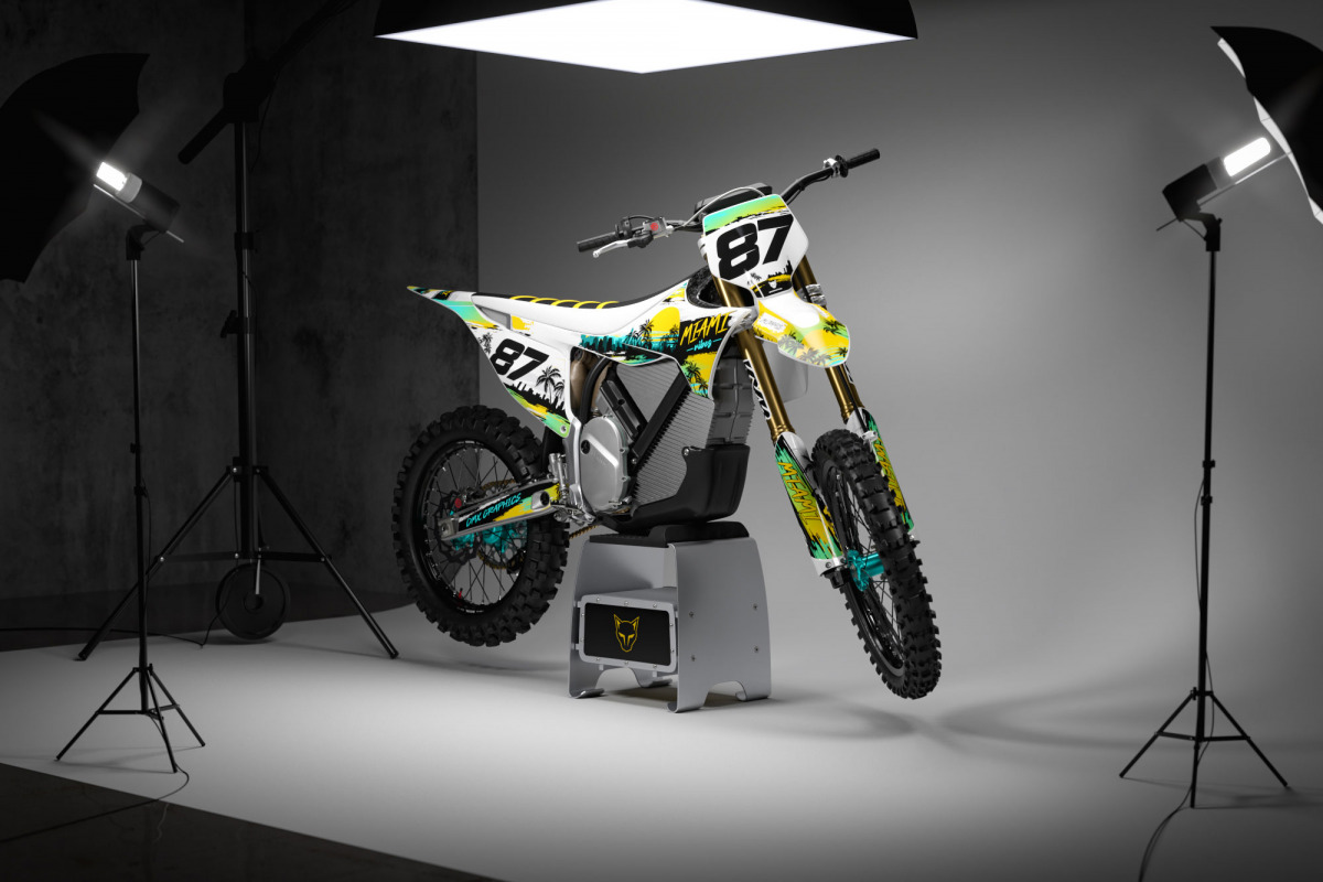
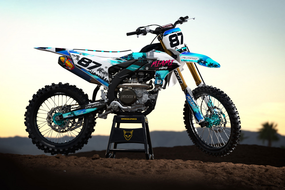
One of the coolest parts of developing a design like MIAMI is seeing how its personality changes from bike to bike. On a KTM, the sharp plastics can make the design feel extremely aggressive. On a Yamaha, the larger blue bodywork creates a completely different canvas. Honda, Kawasaki, Suzuki, Husqvarna, GasGas, Beta, Sherco, TM Racing, Stark and Triumph all give the same artwork their own character. That’s why we don’t want every version to simply be a resized copy of the original. MIAMI is available for most models since 1998, and each version is adapted around the shape of the specific bike. Old two-stroke sitting in the garage? Fresh 2026 machine? Supermoto build? Race bike? Weekend weapon? MIAMI doesn’t really care. If the plastics can handle it, we’ll bring the sunshine.
More personality, less seriousness
Motocross has become incredibly polished. Race teams look perfect. Bikes look perfect. Social media looks perfect. Sometimes it’s nice to throw a little chaos into that. MIAMI isn’t pretending your bike just rolled out of a factory race truck. It’s about giving the machine some personality. And that personality becomes even stronger when the rider starts changing things. We’ve seen countless times over the years that the best custom designs aren’t necessarily the most complicated ones. They’re the ones where the rider looks at the finished bike and immediately thinks: Yep. That’s mine. That’s what custom graphics should do. A motorcycle already says something about the person riding it. The graphics simply turn the volume up. With MIAMI, the volume happens to be somewhere around maximum.
Designed by people who actually know mx graphics
We’ve been doing this since 2011. That’s a lot of bikes. A lot of plastic templates. A lot of strange sponsor logos. And probably more race numbers than we’d ever want to count. Over the years, more than 40,000 riders have ordered OMX Graphics kits, and that experience changes the way you approach new designs. You start noticing the small things. Where a number needs to move because of a plastic curve. Where a logo will disappear once the rider’s leg is on the bike. Where two colors need more separation. Where an element looks great on a flat computer template but won’t make sense once the graphics are installed. Those details matter. MIAMI might look wild and effortless, but there’s plenty happening underneath. That’s usually the trick with a good MX design. Make the complicated part invisible.
Good vibes travel worldwide
We ship regularly to riders across the United States, Europe and the rest of the world. And honestly, seeing the same design show up on completely different bikes in completely different parts of the world never gets old. A KTM somewhere in California. A Yamaha in France. A Honda in Australia. A two-stroke project sitting in somebody’s garage waiting for Saturday morning. Different riders. Different bikes. Same energy.
Build your own miami mx graphics
MIAMI was never supposed to be subtle. It’s for riders who want color. Riders who don’t mind getting noticed. Riders who understand that motocross doesn’t always have to look serious. Choose your bike. Add your race number, name and sponsors. Change the details you want changed. We’ll build the preview, send it over and keep adjusting it until everything feels right. Then we print it. You install it. And somewhere between the pink, turquoise, palm-tree energy and a completely inappropriate amount of throttle, the whole thing starts making sense.
MIAMI MX graphics. Sunshine. Motocross. Loud colors. Good vibes only.