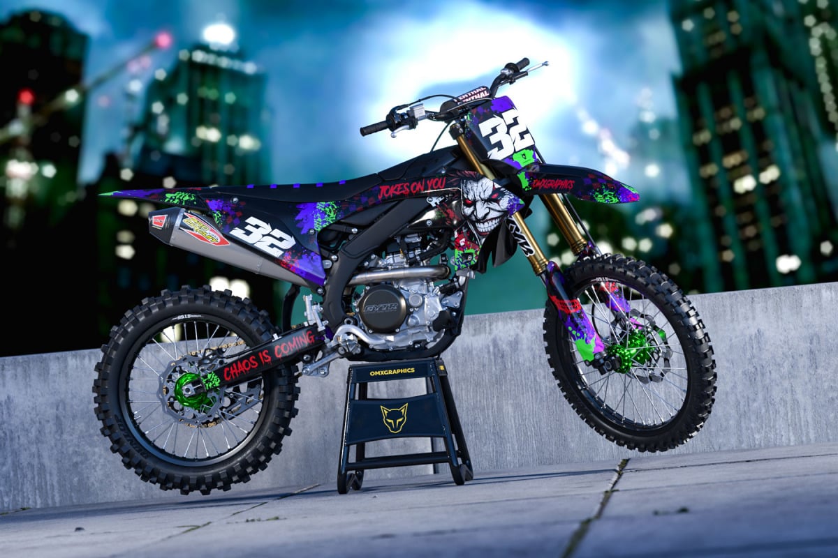
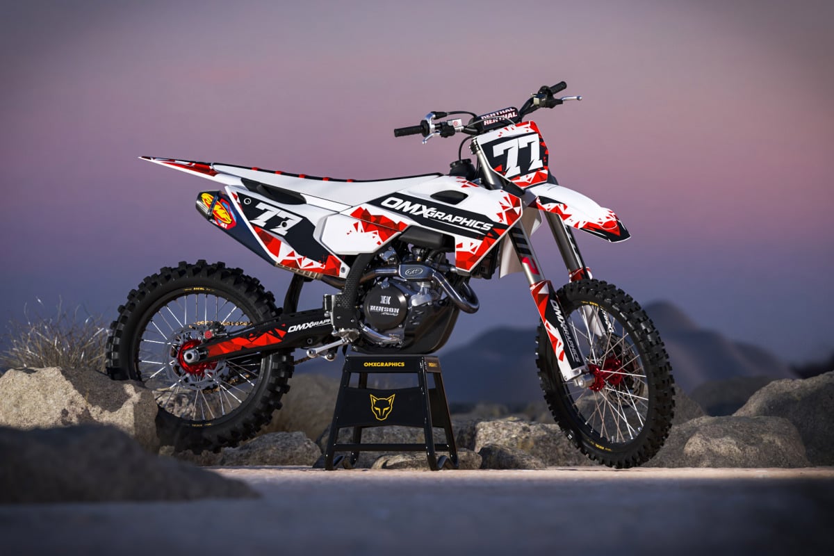
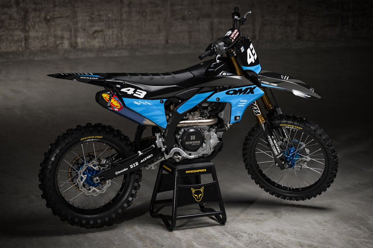
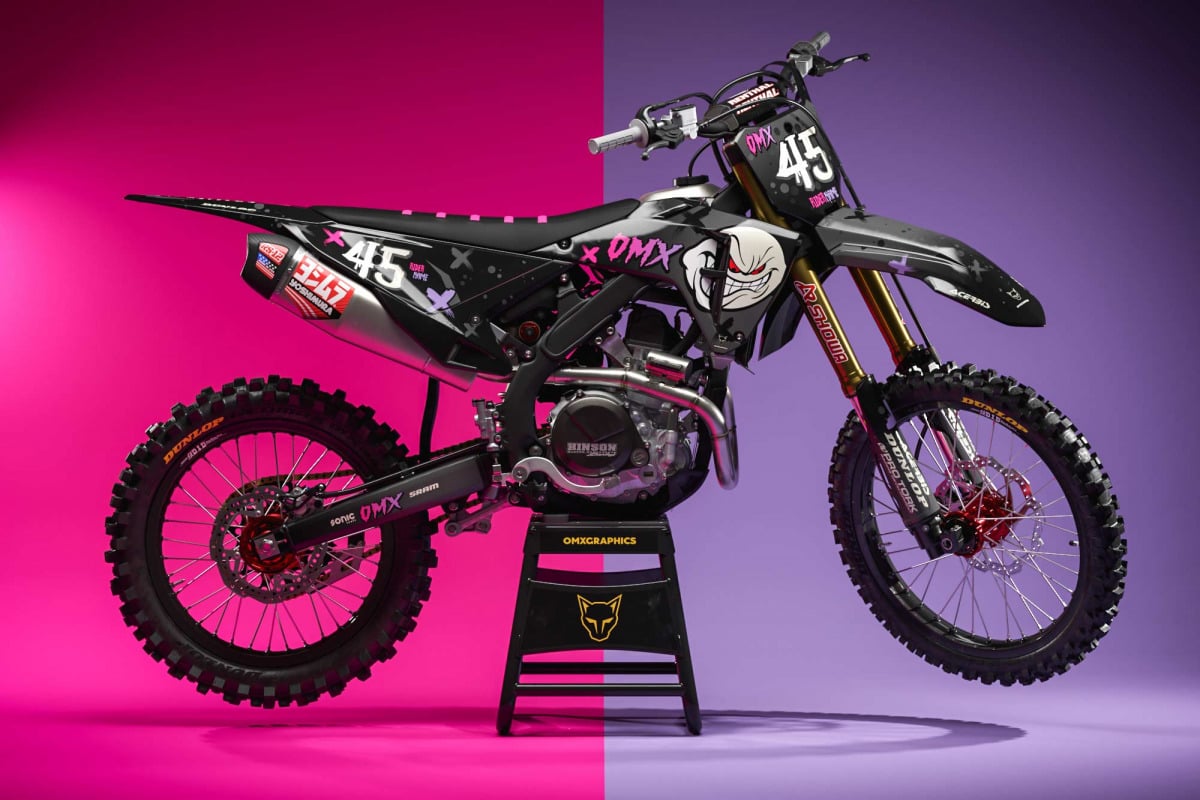
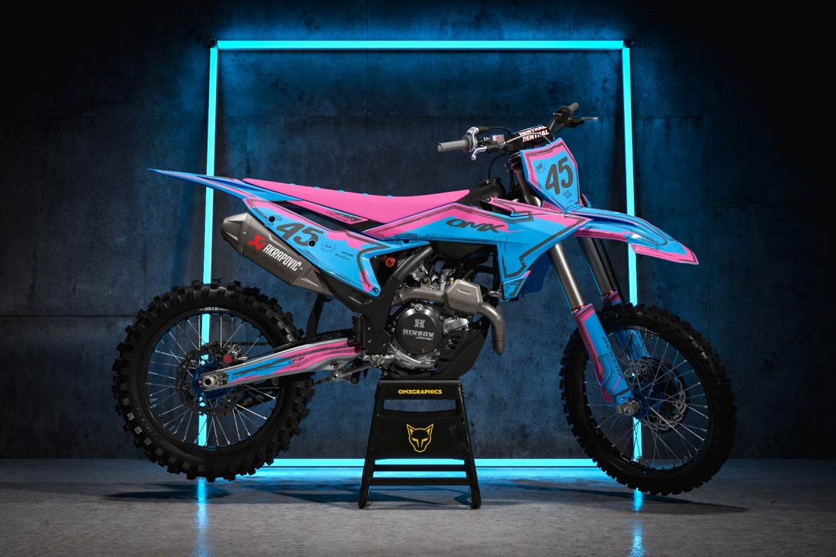
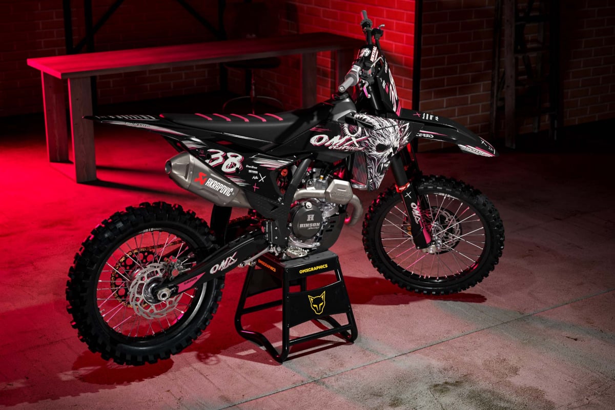
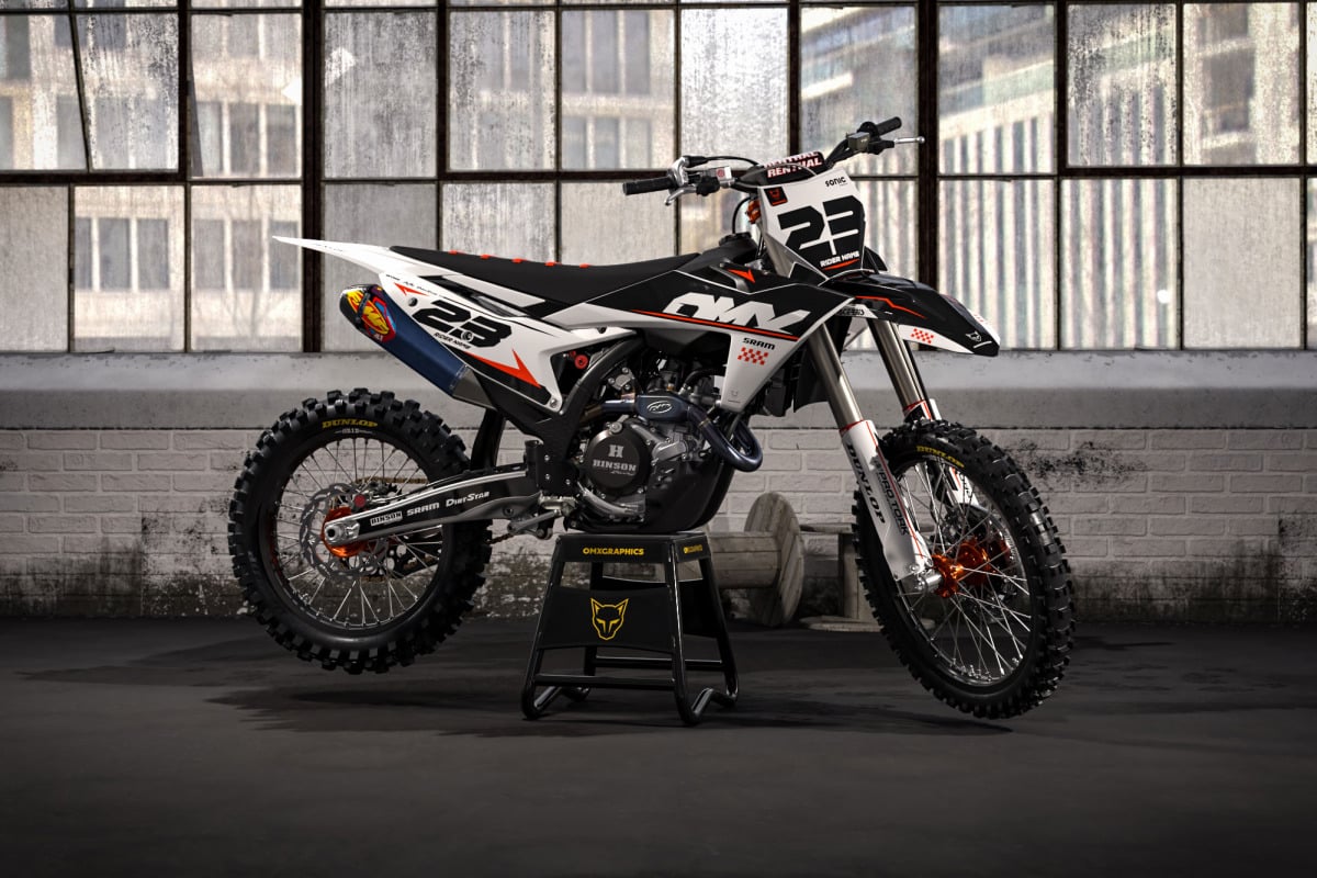
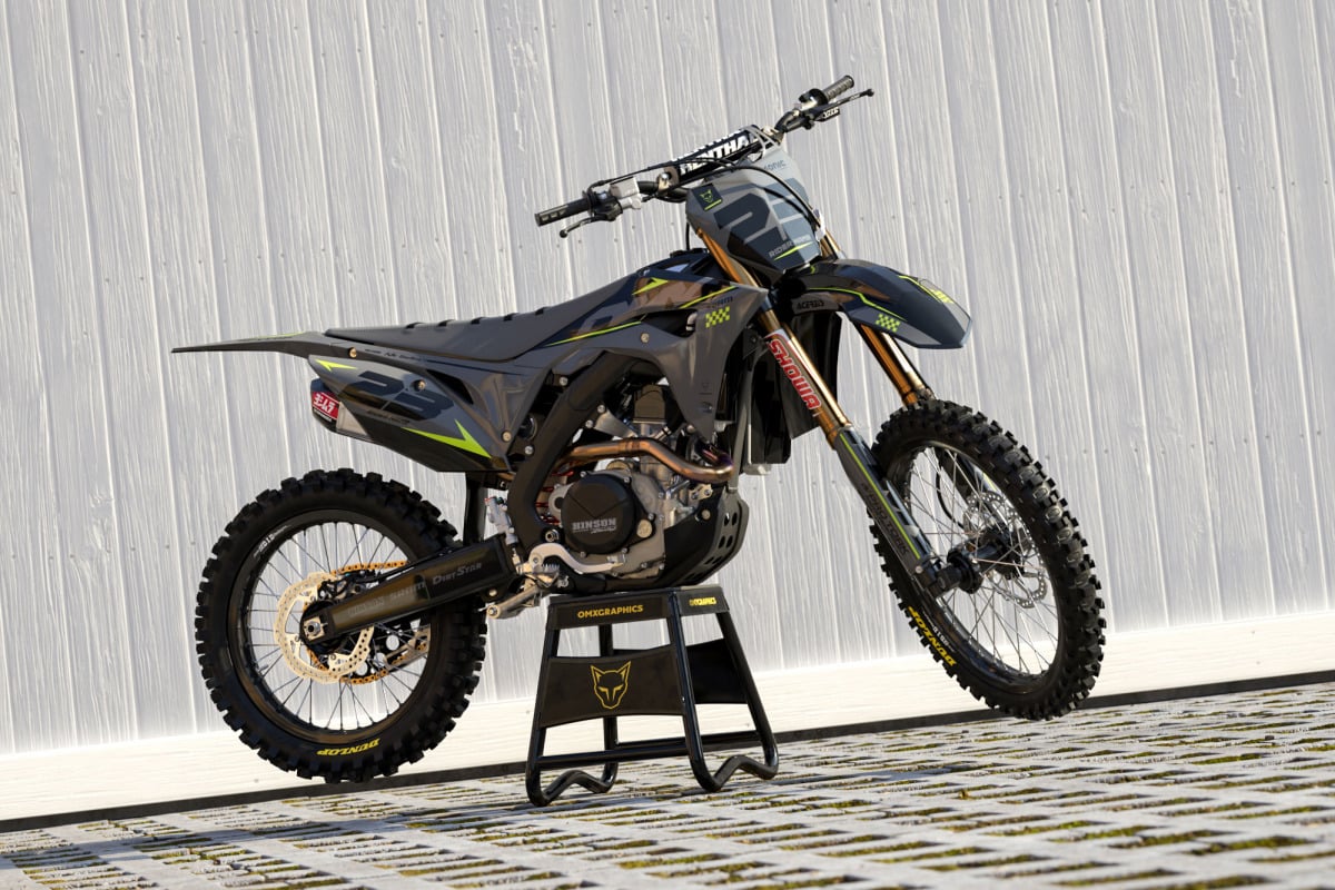
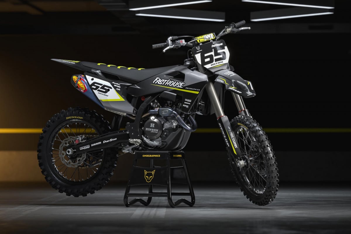
Joker MX graphics design – chaos looks better on two wheels
Joker is not a clean, minimal setup. It’s bold, loud and made to stand out right away. This design uses strong contrast – purple, green and red details on a dark or white base. It’s aggressive, but still structured. The layout follows the shape of the bike, so it doesn’t look random or messy. You roll this bike out, people notice. Simple as that. Strong design that still makes sense A lot of loud designs lose structure. Joker doesn’t. Everything is placed to fit the plastics properly. The lines flow from front to rear. The graphics stay tight around the bike, not stretched or awkward. The Joker face and details add character, but they don’t ruin the overall look. It still feels like a proper, well-built design – not just random graphics thrown together. Built with proper materials Looks are one thing. Durability is what matters after the first ride. […]
Joker MX graphics design – chaos looks better on two wheels Read More »